Building for users: Design decisions behind 2 Refined sites explained

We use Refined to run 10+ sites from one Confluence/JSM instance. We show you how each one is purpose-built for its audience.
In 2020, after 10 years of running Confluence and Jira Service Management on server, we migrated to Atlassian cloud.
The move enabled us to modernize and streamline our intranet, as well as our public Confluence- and Jira Service Management-based sites. Critically, it also unlocked a new level of flexibility in the way we use our Atlassian tools. Paired with Refined Sites, we can use one Confluence/Jira Service Management instance to power a variety of sites, each serving its own unique purpose and user base.
Today we run more than 10 sites this way. They’re all different, but the strategy to make them successful is always the same: cater to users so they can easily find what they need and carry on.
Below I break down two Refined sites to shed light on our thinking behind the details and the choices we made in hopes it helps you build user-centric sites of your own.
Site #1: Our Intranet, “Reine”
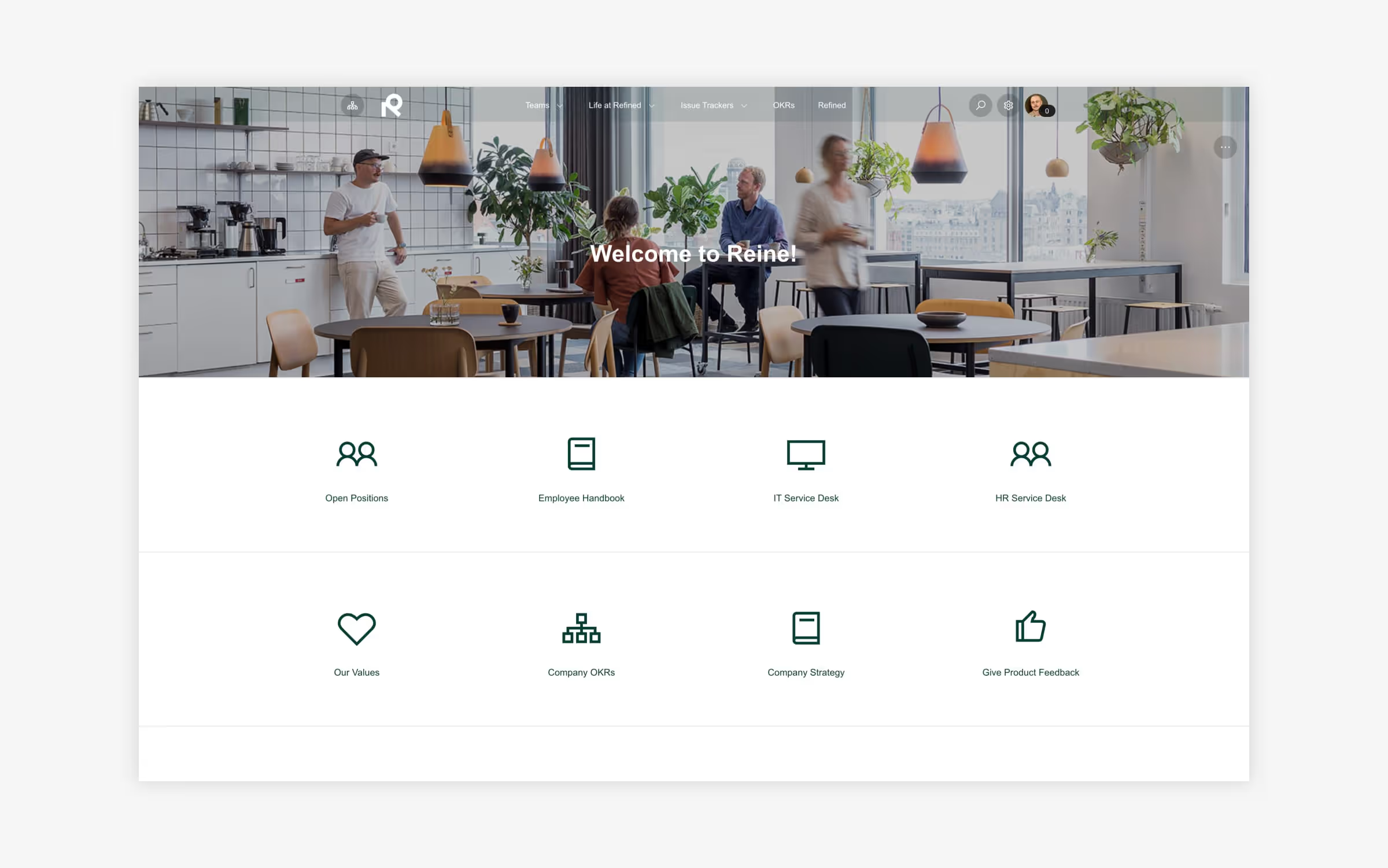
The goal of our intranet was to help employees find relevant information as quickly and easily as possible upon arrival. We achieved this by way of a carefully constructed navigation menu, plus templatized landing pages that streamline the user experience.
More specifically, we used a few key customization options in Refined to optimize the user experience:
- We set view permissions to target certain user groups: For example, we built an onboarding section of the home page that’s only visible to new employees. These new employees are added into a specific user group and then this section is visible just to them. This keeps unnecessary onboarding info away from more-tenured employees, while putting it front and center for those who need it most.
- We put important icons and links in high-visibility areas: In a prominent spot on the landing page, we chose to highlight links to common resources including our employee handbook and company OKRs, for instance.
- We integrated JSM request types on key Confluence pages to make it easy to create a request in-context: For example, we included a vacation request link on a Confluence page about our vacation policy. While reading about vacation time, employees can easily click to create an actual request on-page without switching context by going to the helpdesk.

Site #2: Help Center (help.refined.com)
Our help site aims to help our customers get started with Refined and solve problems, either by reading documentation or by contacting our support team.
We try to make the documentation as accessible as possible. Users should easily find what they are looking for, whether they're just getting started with our products or they’re more advanced Refined users:
- We let the site navigation reflect our products: Both the top-of-site navigation menu and navigation elements on landing pages are oriented around the Refined product and hosting portfolio. As long as customers know which product and hosting they use, there’s no question they’ll be able to navigate to the right place.
- We customized the landing pages to make instructions and guides easy to find: Once a user selects an app —for example, Refined for Cloud — they have a number of ways to find the instructions they need. We prominently placed a search bar at the top of the page, added cards to showcase content groups, and highlight the latest features in a news feed.
Like many other Atlassian customers, our support team uses Jira Service Management. On our Get Support landing page we clearly distinguish between the different hosting methods (cloud and data center), so that users create their ticket in the right portal. On each portal's landing page, we opted to:
- Use navigation icons to highlight important information: Can’t-miss navigation icons make users aware of the product's FAQ and our Service Level Agreement.
- Add request types: Showing all the request types in a project (technical support, performance issues, etc.) makes it easy for users to find the correct request type when they want to file a ticket.
- Show user’s their open requests: The My Requests module offers users a truly personalised experience, since users only see content relevant to their account. They can filter the requests based on status and request type. They can also use the search bar to find requests based on keywords.

More site-building strategies
For more inspiration on how you can embrace the same strategy and use Refined to build different sites for different purposes, watch the full Site Building Live 2022 webinar here.
Read more about


Try Refined free for 30 days


