January 2, 2025
•
6 min read

Our designers spill easy-to-implement advice to make your Confluence knowledge base shine.
If you’re reading this, you probably don’t need us to tell you that building a knowledge base isn’t easy. Especially for larger organizations, structuring, organizing and tagging in Confluence alone is a massive undertaking—saying nothing of migrations from legacy platforms.
But with any luck, when it’s all done users will never know how much time and planning went in. They’ll just hop in, get what they need and be on their way.
Good design can help you get there, delivering not only good looks, but also intuitive navigation that makes information easy to find.
Refined Sites for Confluence gives you the tools to create a winning design, but if you’re like many of the knowledge management, support or IT professionals tasked with building a Refined site, design may not be your primary area of expertise. Fear not: The tips below are meant to help anyone apply tried and true design principles to build an effective knowledge base.
For expertise, we sought the know-how of our in-house designers Matilda Aistre and Katarina Olofsdotter. Together have a decade and a half of design experience, plus more Refined site-builds under their belts than we can count. Here are their tips.
One of the simplest and most effective things you can do while designing your site is to be consistent in the way you apply various design elements.
“Decide on a style and use that throughout your site,” says Katarina. “Both when it comes to the theme and also your content—so that it feels cohesive.”
There is a degree of psychology at play here. According to Gestalt’s law of similarity, the human brain has a tendency to filter what it sees into groups, and it will interpret items in a group as having the same purpose or function.
So in practice, that might mean using shapes and colors consistently to direct the user in targeted ways. “Basically the same things should look the same,” says Katarina. For example, “Decide that this type of navigation will be used for this purpose, and stick to that as you go…and for text, decide what size and color to use where, and use those styles in the same way on all the pages, for example.”
Other ways you can be consistent include:

There are three cardinal “don’ts” you’ll want to be mindful of as you design your site:
1. Density
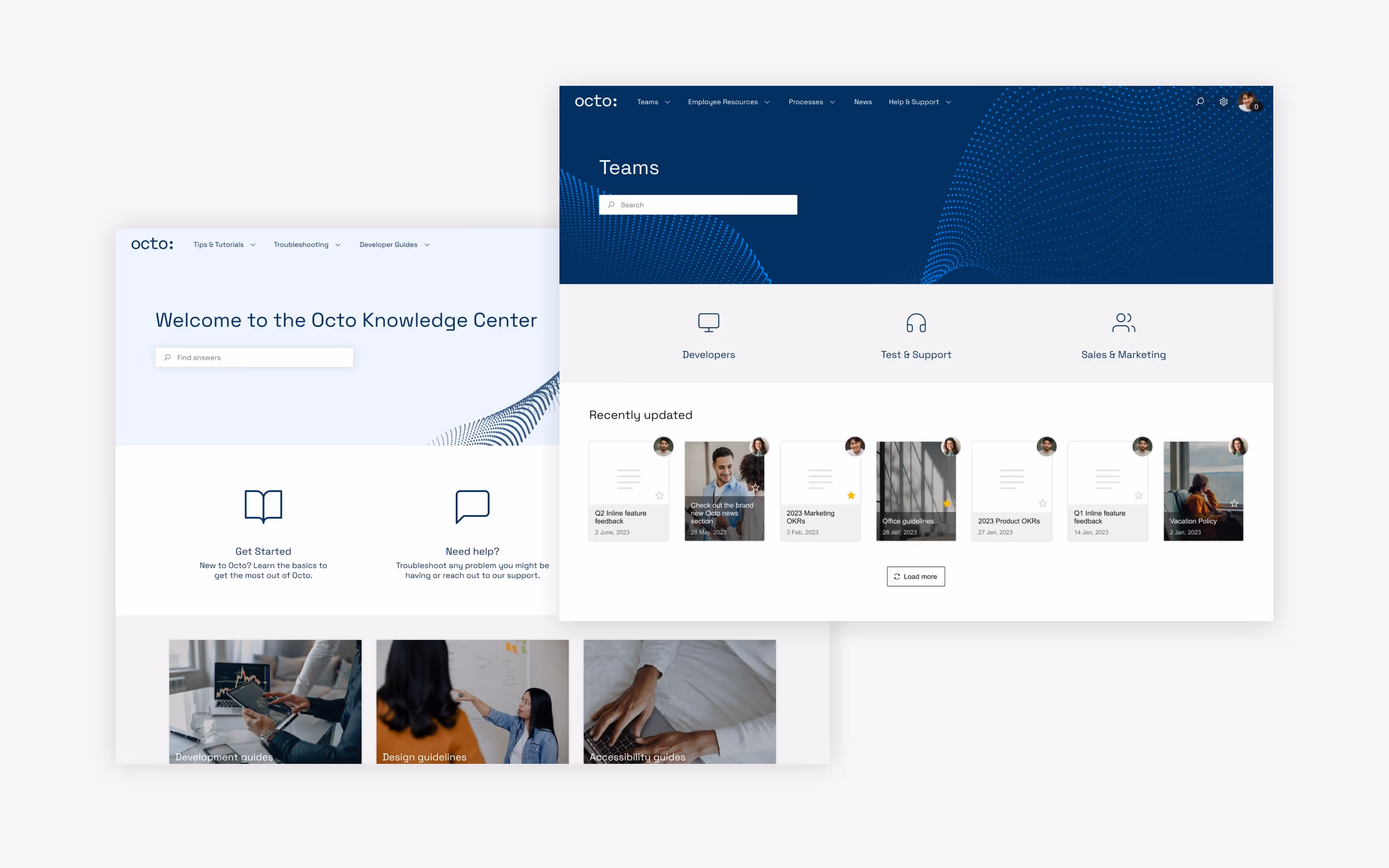
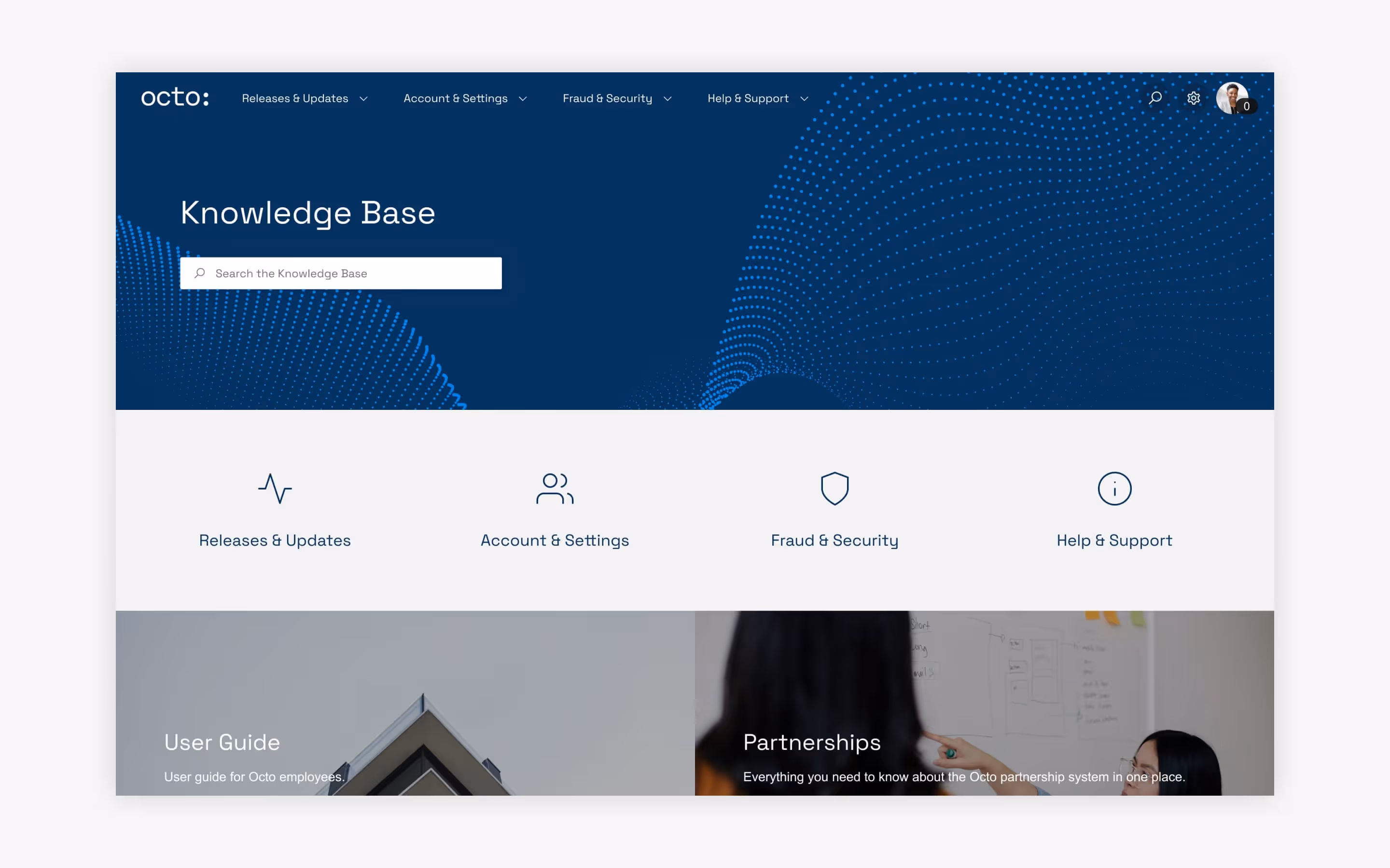
For the sake of the user experience, clutter is the enemy. To that end, try to avoid packing a lot of information into one area. Instead, try segmenting areas of the page according to user need or the type of content housed there, and break up those segments with white space.
To see what we mean, the knowledge bases highlighted here do a great job of avoiding “information overload” by using clusters of navigation modules that link out to different categories of content.
2. Dead ends
Avoid driving users toward dead ends, whether those are dead links (always make sure these function like working ‘buttons’), blank pages (avoid publishing unfinished Confluence pages, linking empty spaces to your site), or blank search results (one way to avoid this is to promote search results as a fallback).
Wherever you send users, it’s always good practice to give them options to go elsewhere, whether that’s through linking back to previous pages or a navigation bar top-of-site.
3. Depth
“Try not to have important content more than a couple of clicks away,” advises Matilda. In a perfect world, users should never be more than three clicks away from the content they need.
You control the depth of your site in the site structure. Drop Confluence content into the structure, and how you arrange it there corresponds to the navigation menu on the front end. Learn how to build and structure Confluence sites.

Not all content is created equal. Some pieces are more important than others and as a result, they’re bound to be accessed more often. Identifying those items and the journeys users will take to reach them can help you decide what to emphasize with design.
“Work with placement,” says Katarina. “Most important first, and then as you go just simmer down to smaller things. Use elements like contrasting colors and size to put visual emphasis on the elements that matter most.”
You may even want to set the most important content apart on its own. Ask yourself: Should this content have more space? Should I raise its significance by setting it apart on its own, or should it be grouped with other content?
“You could try alternating layouts with, say, four columns of icons and then a two-column split image…and then a full-screen image just to have more of a dynamic feeling,” says Matilda. “And that’s also a good way to make the focal points stand out, to make them bigger.”
The ultimate focal point might be a Navigation Highlight module that runs the full width of the page, but there are lots of easy design tricks at your disposal to highlight the content that matters most:
Before we turn you loose to create focal points, a word of caution. Be intentional by only highlighting the stuff that really and truly needs to jump out to the user. “If you highlight everything, nothing will stand out,” warns Matilda.

Modules like Navigation Highlight, Search Highlight and Navigation Content can be customized with images, which “are always a good, quick way to make your site come alive,” says Matilda. “Aim to have more original imagery rather than stiff stock photos, and if you don’t have access to more original ones, try sites like Pexels, Unsplash or Snapstock.”
If you have access to a brand, marketing or design team, you could explore whether they manage a portfolio of brand imagery and ask for access.
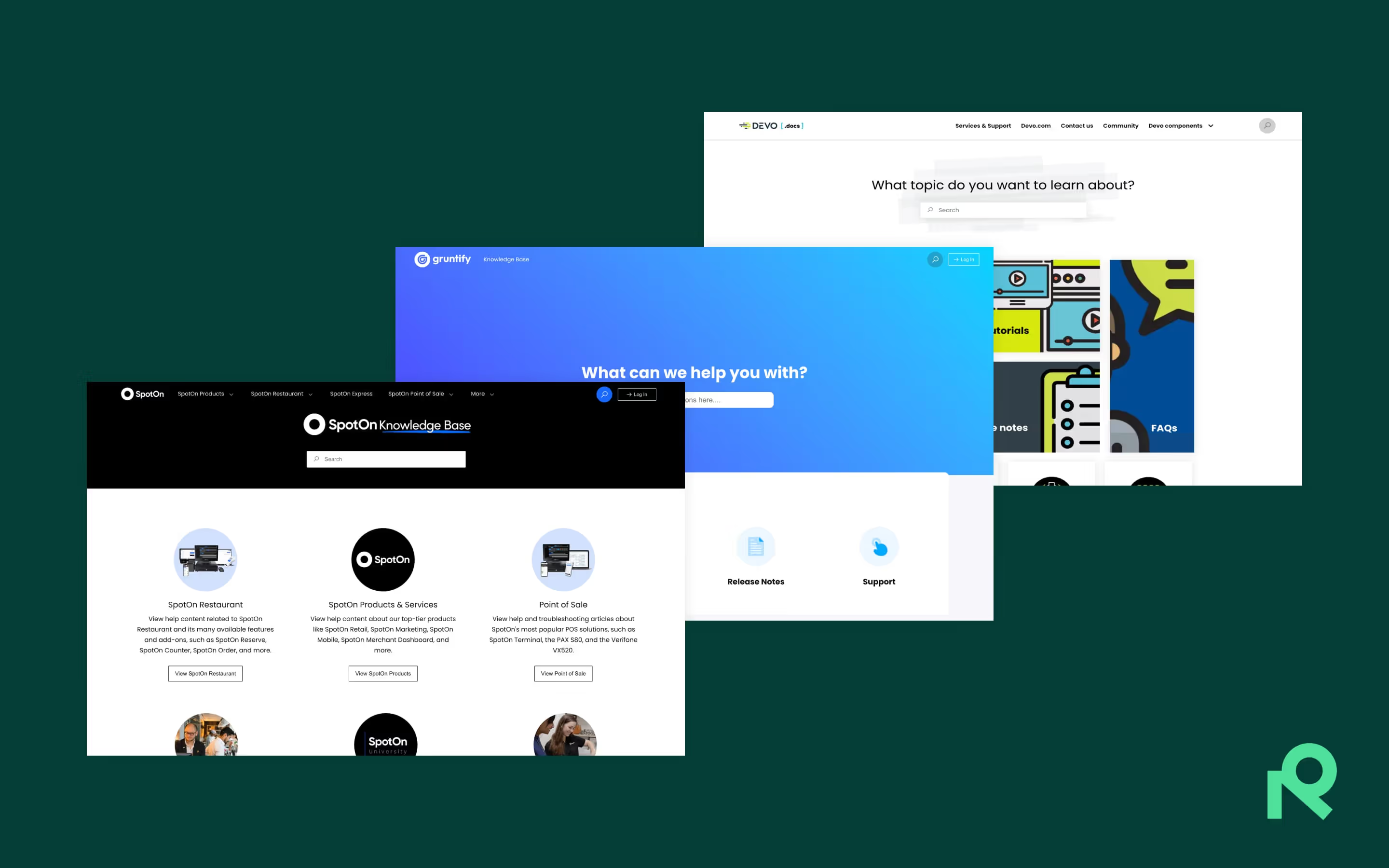
Keep in mind that images don’t always have to depict things or people. They can be conceptual, too. Some companies prefer to showcase branded designs, abstractions or illustrations. Take a look at SpotOn’s help center and our own migration site to see what we mean.
Another word of caution: Be mindful that image size could impact load times and eat up data on mobile devices. We recommend keeping the total file size below 400kb per page if you can swing it.
The sky’s the limit when it comes to modules, layouts, colors, and text—there’s a lot to customize. But rather than go nuts, try to exercise thoughtful restraint as you design.
Take color. “One or two colors will take you a long way,” says Katarina. “You could even do one hue and just work with tints and shades within that [hue]. If you’re not one hundred percent sure what you’re doing and if you don’t have a brand color set that you know how to use, then usually the simpler, the better.”
Whitespace can do wonders to keep things simple. “Create some air,” advises Katarina. “It’s going to give you a calmer feel.”
To see simplicity at work, take a look at Gruntify’s help center.
The design process is fluid. There’s no decision that can’t be changed with a few easy clicks. So with that in mind, don’t be afraid to play around with color, modules, layouts, and placement until you like what you see.
“You can preview without publishing to get a sense of what’s working and what isn’t,” says Katarina. “That takes the stress off. It’s foolproof because [Refined] saves your unpublished changes as a draft and allows you to restore previously saved versions if you’re not happy with the changes.”
In particular, play around with modules. “Learn the modules and see what they can do, and experiment,” says Katarina. “They’re usually pretty moldable, and what some people would do with custom code you can often do with settings, so take some time to explore.”
Taking time to get the design right is likely to pay off in the form of a better experience for users, a higher rate of repeat visitors, and enhanced ROI on your Confluence-based knowledge management or support strategy.
“Keep in mind that a site is not only for displaying content,” says Matilda. “It’s also about the journey and wanting users to have a good experience, and getting them to come back.”
To take full advantage of all the ways you can structure and organize your knowledge base, read this guide, and if you have questions as you build, refer to our help site or contact our support team.
Try Refined Sites for Confluence for free for 30 days on the Atlassian Marketplace.

