New to Confluence? Don’t make these 7 mistakes

Watch out for these common pitfalls when setting up Confluence, plus ideas to transform your instance into a user-friendly, personalized powerhouse.
Setting up a Confluence instance can, at times, feel like assembling a jigsaw puzzle. There are spaces to create, roles to assign, users to manage — the list goes on. Along the way, you’d be forgiven if you deviated from the best practices that are second knowledge to those with a bit more experience using the tool.
Good news: We can help you avoid costly setup errors that drag on your time and resources down the road.
Below, we break down seven mistakes you might be making when setting up your Confluence instance, as well as how to avoid them.
1. Overcomplicating the structure
The pitfall:
One of the most common mistakes on the quest for a complete Confluence instance is overcomplicating the site structure. It’s easy to get carried away, creating a labyrinth of spaces, pages, sub-pages, and links in the name of organization.
However, a convoluted structure can lead to a serious case of user confusion, making it difficult for your users to find the information they need.
How to avoid it:
Keep the site structure simple and intuitive. Outline primary spaces before you build, and use labels to group related content.
2. Overloading pages with content
The pitfall:
It’s tempting to cram as much information as possible onto a single Confluence page, especially if you want to create a comprehensive resource.
More information means more resources and guidance for users, right?
Unfortunately, pages that are too content-heavy can simply overwhelm your users, making it difficult for them to find key content pieces they may be in search of.
How to avoid it:
Aim for clarity and conciseness. Break up long pages into smaller, more digestible sections, using headings and subheadings. Use hyperlinks to direct users to detailed information on separate pages, instead of amassing content on the same page.
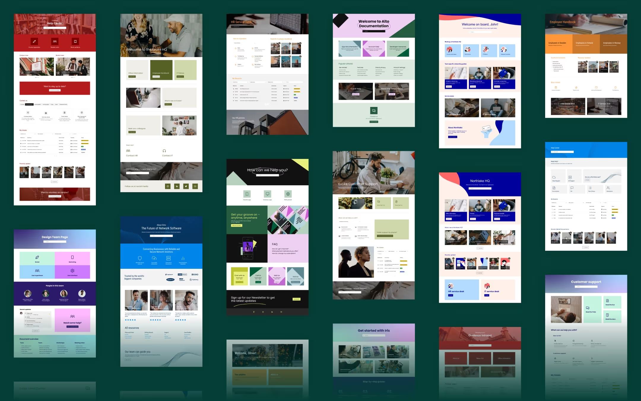
If you’re using Refined Sites for Confluence or Refined Toolkit for Confluence, our ready-made templates guide you in implementing a page structure that makes it easy for your users to find what they are looking for without feeling overwhelmed. And in Refined Toolkit for Confluence, content formatting macros will help structure your content.

3. Ignoring personalization
The pitfall:
Serving up the same Confluence content for all of your users is a huge, missed opportunity. A one-size-fits-all approach might seem efficient, but it often results in a Confluence site that feels impersonal and disconnected from the unique needs of your user-base.
When your site lacks personalization, users might struggle to find crucial content that’s relevant to their unique needs. The result? Engagement drops, and users are potentially left confused and dissatisfied.
How to avoid it:
Tailor your Confluence instance to the specific needs of your team by incorporating personalization where it matters.
Start by understanding your users – what information do they need most frequently, and how do they prefer to access it? Then, create landing pages or spaces dedicated to different user groups, where relevant updates, resources, and tasks are front-and-center.
And leverage tools to help you out. In Refined Sites, for example, your Confluence admins can more easily control which content different users get to see.

4. Neglecting navigation
The pitfall:
A well-structured Confluence site can still fall flat if users can’t easily navigate it or find what they’re looking for.
Let’s face it — poorly designed navigation menus, a lack of links between related pages, and ineffectively using Confluence’s search functionality can all contribute to a deeply frustrating user experience.
How to avoid it:
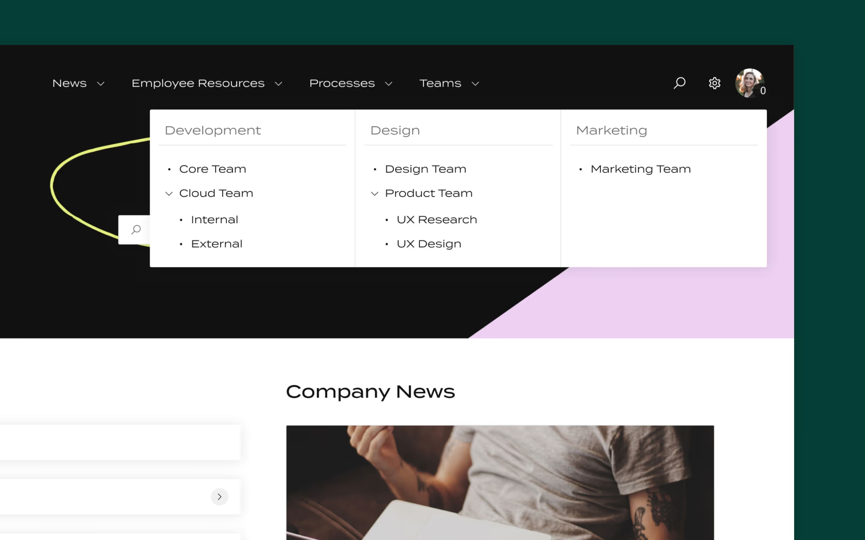
Invest time in designing intuitive navigation. Use Confluence’s built-in navigation features (like the sidebar, top menu, and breadcrumbs) to guide users through the site. Ensure that every page includes relevant links to related content.
You might want to consider using a pre-built, customizable template for your site type (intranet, knowledge base, or documentation site), which comes with a suggested structure and layout for intuitive user page navigation.
Go a step further and implement Refined Site’s modules to help optimize your page structure for easier user navigation.
Read our article on page-building recommendations for easier page navigation for your users.

5. Settling for standard search
The pitfall:
Navigation and searchability often go hand-in-hand, and whether or not your users are able to find what they’re looking for easily can determine if their experience is positive or negative, and whether they want to keep using Confluence.
Not treating your Confluence instance’s search options with care and attention can be a massive mistake — and may contribute to the 3.6 hours each day that employees report spending searching for information.
How to avoid it:
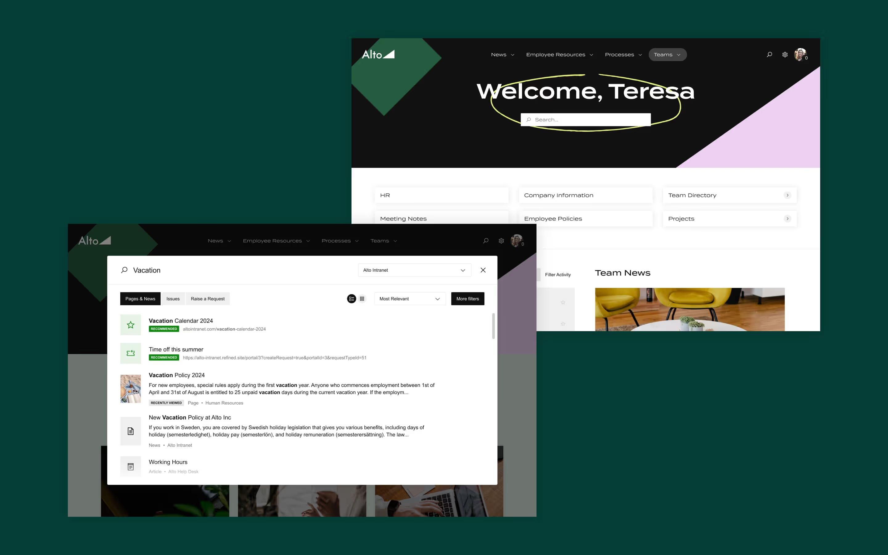
Optimize your use of labels and keywords to enhance searchability, and consider enabling more advanced and practical search tools. Refined Sites includes a module that allows you to configure user search results according to their anticipated needs, assisting users in finding content faster based on the keywords they use.
6. Dropping the ball at rollout without user training and awareness campaigns
The pitfall:
Even the best-designed Confluence site can fall short if users don’t know how to navigate or contribute to it effectively — or if they don't even know it exists. Without proper training and promotion, team members may struggle with basic tasks, leading to frustration and a drop in productivity.
How to avoid it:
Invest in comprehensive onboarding for new users:
- Hype your intranet at launch with buy-in from execs, and an organization-wide rollout campaign.
- Create guides and tutorials that cover essential functions (such as how to create and edit pages, search for content, and use collaborative features like comments).
- Hold regular training sessions.
- Encourage a culture of continuous learning by sharing tips and best practices in a dedicated Confluence space.
7. Not planning for scalability
The pitfall:
What works for a smallish team today may not work for a larger, more complex team next year.
Failing to plan for scalability can result in a Confluence site that’s tough to manage, with outdated or duplicated content, disorganized spaces, and an overall lack of coherence as your pool of users grows.
How to avoid it:
Design your Confluence site with future growth in mind. You’ll want to establish clear guidelines for creating new spaces and pages to ensure consistency in your content. Implement a content management strategy that includes regular reviews and archiving of outdated content.
Final thoughts
By applying our recommended strategies and tips, you can create a Confluence instance that's more intuitive for your user audiences and easier for them to utilize, ensuring a more personalized experience for them. With the right tools and a bit of thought, and help from apps on the Atlassian Marketplace, your Confluence instance can be a powerful tool that grows with your team’s needs.
Looking to learn more about building a great Confluence instance? Read our 10 Commandments of Confluence intranet success.
New to Refined Sites for Confluence? Give it a whirl right now with a free 30-day trial from the Atlassian Marketplace.
Read more about


Try Refined free for 30 days


