Can a Confluence knowledge base be beautiful? Sure can. Here are three examples for proof.
January 2, 2025
•
6 min read
•
by
Philip Garrity
Can a Confluence knowledge base be beautiful? Sure can. Here are three examples for proof.
Knowledge bases aren’t exactly known for their looks. But that doesn’t mean they have to be bland.
If anything, just the opposite: Taking steps to improve the user experience on your knowledge base can pay dividends in the form of improved navigation, easier-to-find information, and fewer customers emailing or calling for hands-on help.
If you’re using native Confluence to power your knowledge base, you may be only scratching the surface of what’s possible in terms of customization and design. Apps like Refined Sites for Confluence from the Atlassian Marketplace give you the tools to build knowledge base sites that look and feel like modern websites, no code required. Done right, they can delight users with thoughtful design that makes help easy to find— all wrapped in a theme that matches your brand guidelines.
To prove our point, we rounded up three appealing Confluence-based sites. Each is built with Refined Sites for Confluence and each boasts an easy-to-navigate UI, a custom domain, and good looks to boot. Here they are:
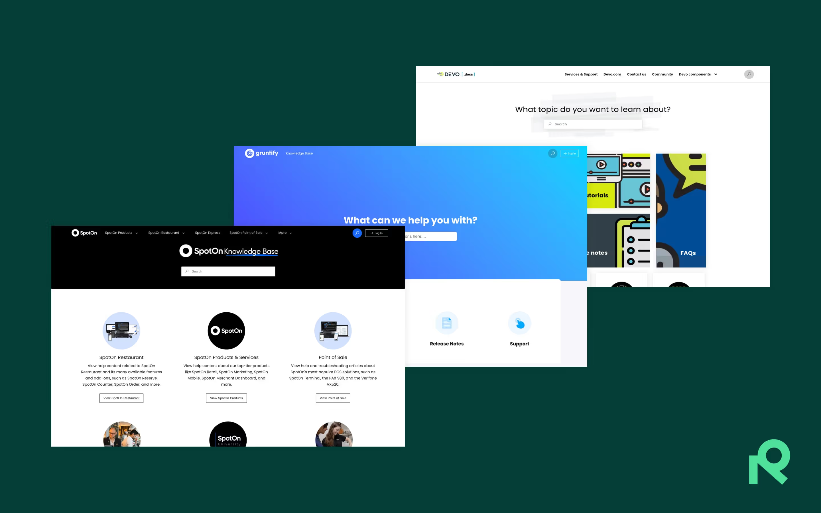
1. Gruntify’s help center
Company: Newstead, Australia-based Gruntify makes software to help insurance and maintenance teams manage field inspections, reporting and logistics.
What’s it for? Customer help center with knowledge base articles, FAQs, release notes, and support.
Gruntify’s minimalist layout and navigation-focused design provide a distraction-free user experience.
Why we love it:
In a word — simplicity. Gruntify’s minimalist approach prevents the information overload symptomatic of more-crowded sites, and it’s achieved with a few strategic design decisions:
Super-sized Search Highlight: The dominant element of Gruntify’s help center is an extra-tall Search Highlight module with a faded monochromatic background in the brand’s signature blue. Search Highlights, as you might guess, encourage users to search if they’re placed prominently on-page, and they can be customized with colors and gradients using built-in tools or your own imagery.
A handful of custom-coded Navigation Highlights: Grunitfy’s show-stopping Navigation Highlight modules are large and easy to read, and they’ve been custom-coded to add shadows, rounded corners and brand fonts.
Minimalist header and footer: Gruntify’s emphasis on simplicity carries through even to the header and the footer, which sports one of the cleanest, simplest designs we’ve seen on a Refined site.
2. SpotOn’s help center
Company: San Francisco-based SpotOn makes software and payment solutions for businesses.
What’s it for? Customer help center with product instructions, onboarding guides, a bridge to product support, and other resources.
A consistent design across their pages and cleverly used modules ensure SpotOn’s help center makes user navigation a breeze.
Why we love it:
Branded Search Highlight: If you know the SpotOn brand — and presumably visitors do, as customers are the intended audience — you needn’t look further than the Search Highlight’s background to recognize it. Adding branded imagery is a simple and effective way of telling users they’ve come to the right place.
Modules optimized for navigation: SpotOn went the simple route for their knowledge base home, with four Navigation Content modules placed prominently under the Search Highlight to help users get around. So that users know what’s behind every click, they’ve made full use of the modules, adding an image, a headline, explainer text and a button to each. (You can add as much or as little to the module as you’d like.)
Design consistency site-wide: Landing pages share the layout of the site home — a Search Highlight with Navigation Content modules below — making for a consistent architecture site-wide.
Adding branded imagery is a simple and effective way of telling users they’ve come to the right place.
3. Devo’s documentation site
Company: This Boston-based enterprise helps organizations safeguard their data, thanks to Devo’s security data platform.
What's it for? From video tutorials to FAQs, the documentation site provides users with a broad range of content related to Devo’s data management software.
The use of striking visual design elements makes content exploration on Devo’s documentation site faster and more engaging for the user.
Why we love it:
Clean navigation and hierarchy: In structuring their documentation site, Devo emphasized clarity. Content is grouped under straightforward headings, with a minimalist space layout that keeps the attention squarely on documentation links. The de-cluttered, simple layout is a boon to users searching for specific documentation material.
Bold, clear visuals: Devo’s selective use of colors and sizable images help to ease readability, while keeping user navigation focused. Plus, it makes the documentation site more fun and memorable for the user.
Responsive, accessible UI: Further aiding user navigation are some smart design choices – many of the image links darken when hovered over, and the icons are descriptive while staying consistent. While these decisions help the site look slick, they’re also useful bits of UI magic that help to visually communicate information to the user.