Don’t let these 3 design hurdles hold back your JSM help center
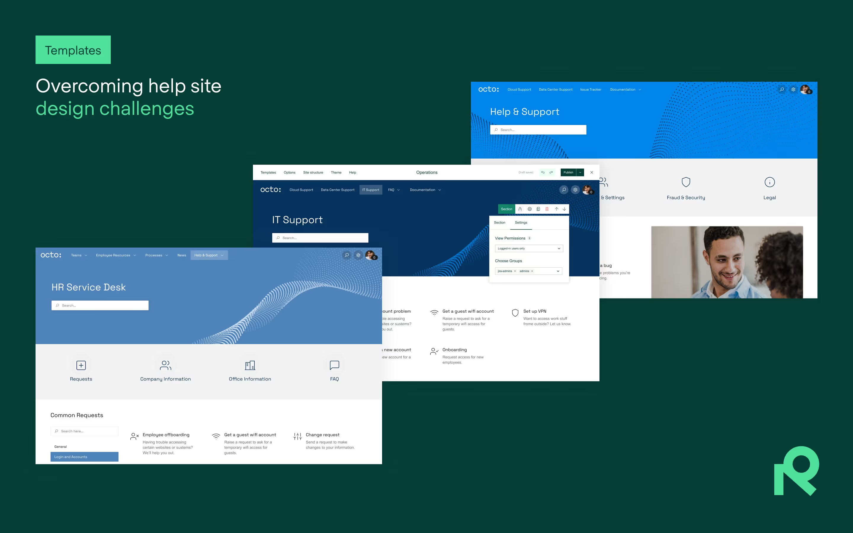
We show you how to overcome three design challenges that could keep your Jira Service Management (JSM) support site from putting a smile on users' faces.
A well-designed JSM help desk (or support site or help center) can mean the difference between a smooth user experience and a support nightmare.
So, what’s standing between you and a JSM support site that dazzles?
In this post, we identify three design hurdles that Atlassian admins face – along with practical tips on how you can tackle them. Let’s dive in.
1. Publishing an intuitive support portal that helps rather than hinders
Has making sense of a support site ever left you feeling dizzy? A significant challenge in designing a JSM help desk or support site is ensuring your users will find the pages easy to navigate. A cluttered or confusing page interface can lead to customer frustration, increased support tickets, and a poor user experience overall.
To achieve that, you’ll want to do the following:
Simplify your page layout
- Start by paring things down, as too many categories can overwhelm users. It’s best to use clear, concise labels and group similar items together to reduce clutter.
- When designing pages, ensure that key functions – raising a ticket, searching through frequently used resources, and tracking requests – are prominently displayed. You don’t want users to have to hunt for essential functions.
- Use consistent design and language across your site. This will make your pages more cohesive, intuitive, and easier to navigate.
- Want more tips? Read our article on designing an effective JSM support site.
Provide user-centric navigation
- A solid navigation bar can make a world of difference. Keep it simple, but ensure it covers all the important sections of your help desk. Implement intuitive navigation bars to guide your users.
- You also want to include a robust search function. Sometimes users just don’t know exactly where to go, and a smart search can aid users in efficiently finding what they need. Make sure the search function is prominent and easy to use.
Harness pre-designed templates
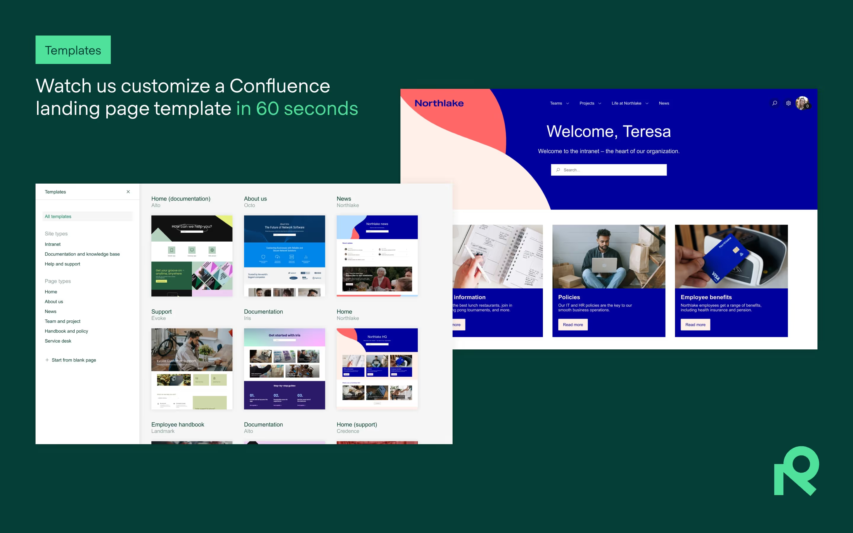
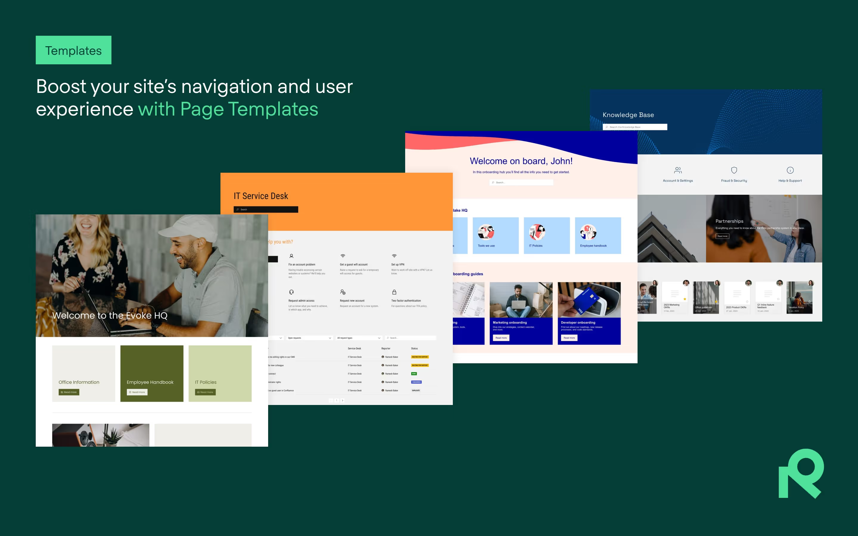
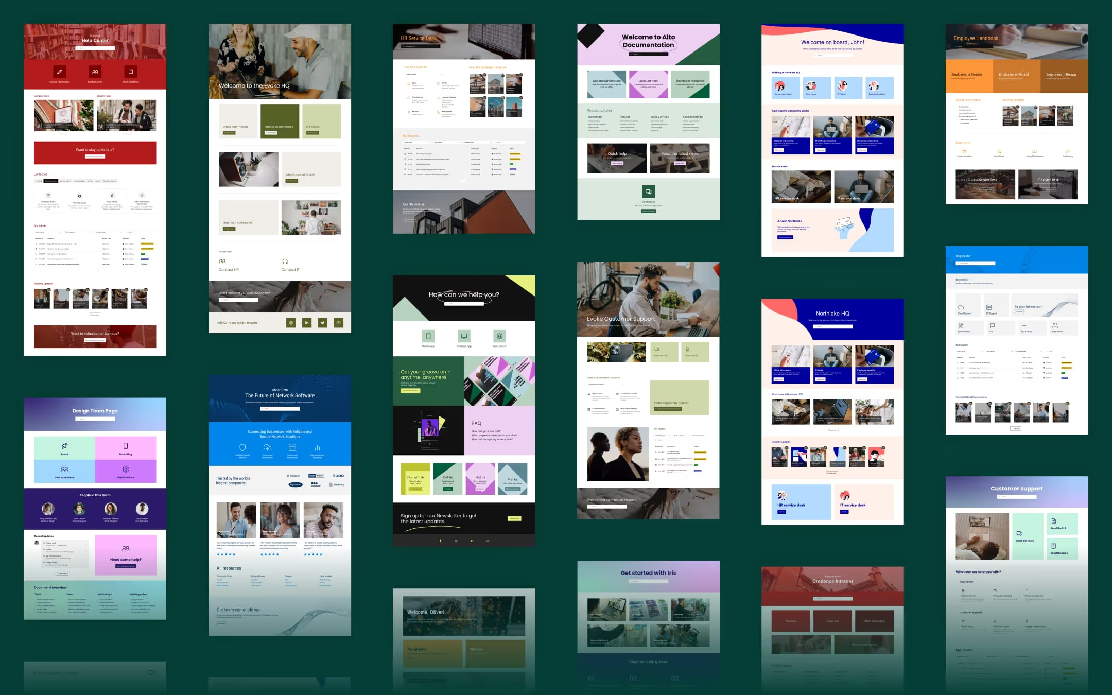
- Not a design whiz? No worries. Templates for JSM can take the guesswork out of building your support pages. Refined Sites for JSM offers a variety of templates that are functional and user-friendly. These templates guide you in creating a visually appealing, easy-to-navigate help desk without having to start from scratch.
2. Meeting customer expectations for the look and feel of your help center
While function is critical, form matters just as much. Your users expect a help desk that looks professional, is aligned with your branding, and doesn’t overwhelm them with information.
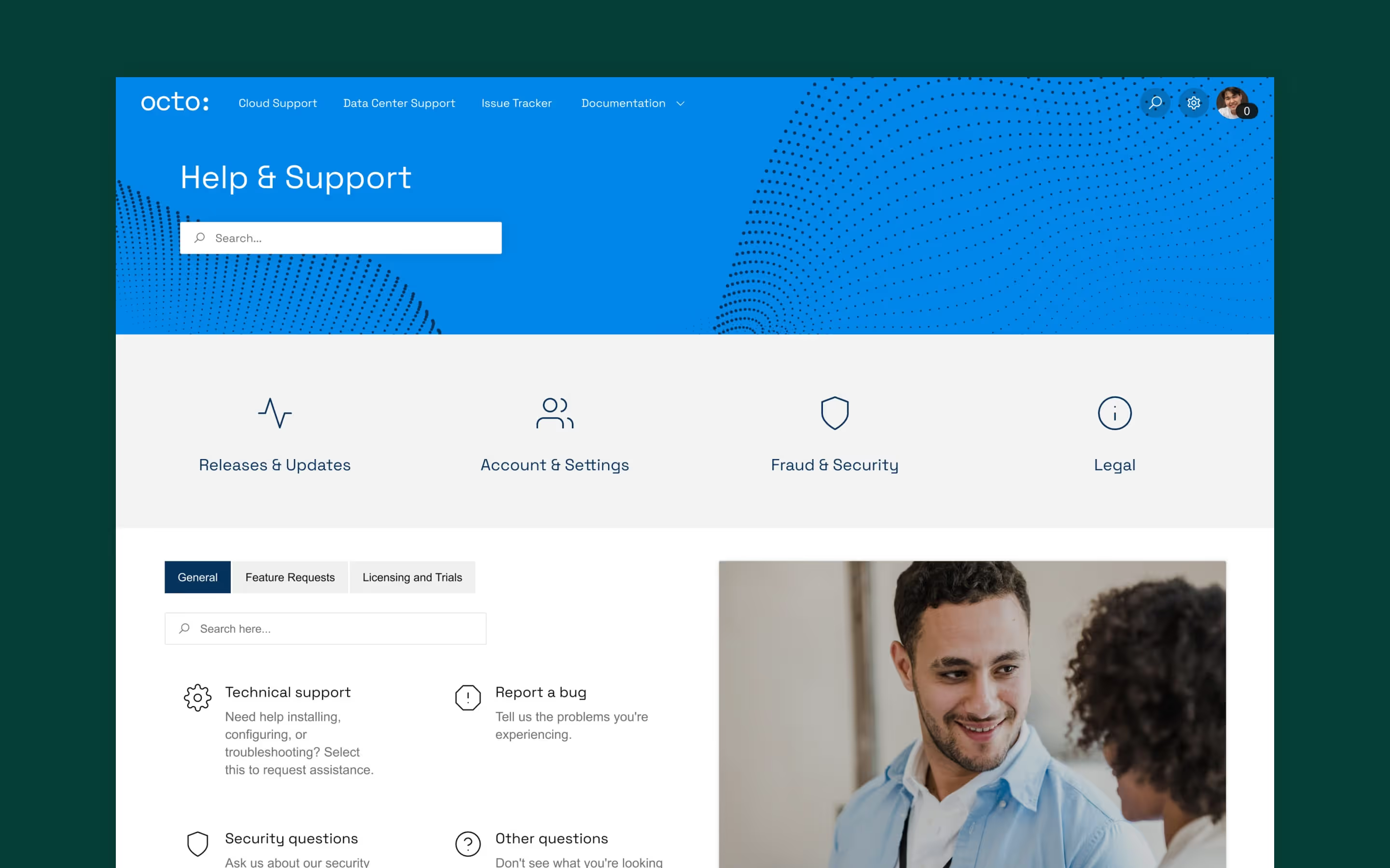
Achieving this balance between aesthetics and usability can be a challenge, as unfortunately native JSM can be a bit lacking in the personality department.
With that in mind, here’s a few goals you’ll want to aim for:
Employ UI best practices into your page design
- Direct users’ attention with a clear visual hierarchy – use size, contrast, and colors to highlight important information or actions, like ticket submission or FAQs.
- Use clear, concise labels and group similar items together on a page to reduce clutter and improve user navigation.
- Menus and categories should be straightforward and easy to follow. Try to keep anything a user might need to less than two or three clicks away. Again, Refined Sites for JSM can help by offering ready-made page templates that incorporate UI best practices, ensuring your pages are user-friendly from the start.
Apply your company’s branding
- Incorporate your brand’s logo, colors, and fonts into your page design. Consistency in colors and fonts helps users instantly recognize your company’s presence, and it helps to align your support site with other customer-facing touchpoints like your main website.
- Customize the layout of your support portal to reflect your brand’s tone. The way your help desk is laid out can reflect your company’s personality: a clean, professional company may want a more minimalistic layout, while a creative brand might opt for vibrant designs.
Develop user personas to guide your page development
- Different users have different needs, so it’s important to design your help desk with those personas in mind. For example, a technical support user may prioritize access to troubleshooting guides, while a customer service rep might be more focused on submitting and tracking tickets. By understanding these personas, you can tailor your site’s layout, content, and navigation to ensure that every type of user finds the experience helpful and relevant.
Update and iterate your pages
- Test different layouts, color schemes, and fonts to see what resonates best with your users and your brand.
- Design is never one-and-done. Gather feedback from your users in order to see what design elements work and what needs improving. Then, leverage a tool like Refined Sites for JSM to help you effectively manage your user feedback.
3. Managing permissions and user roles for secure and personalized support
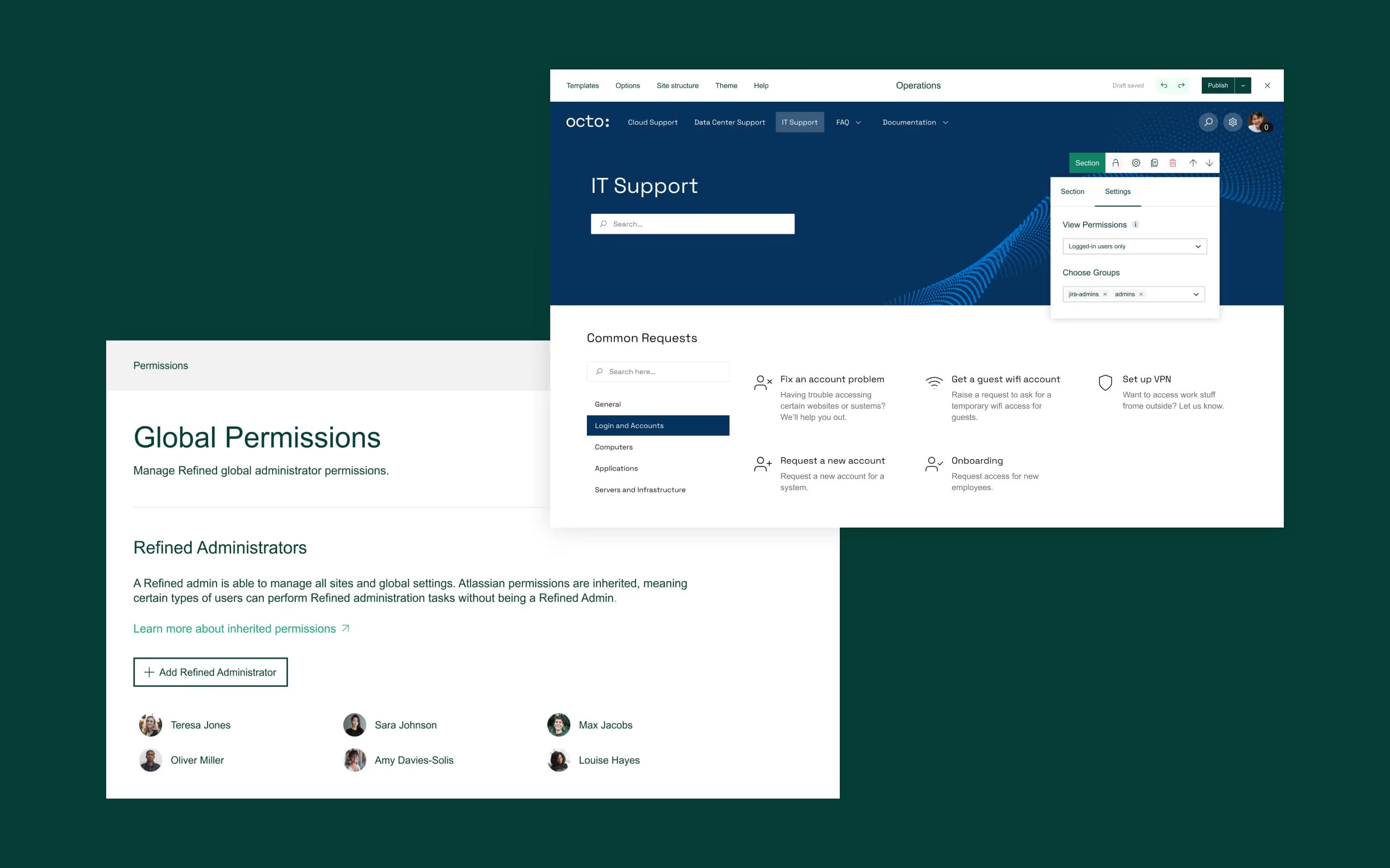
User permissions are an often overlooked, yet critical aspect of designing a successful help desk. Incorrectly assigned permissions mean users can have unneeded or unnecessary view or edit access to pages and sites. This can lead to confusion, inefficiencies, and even security risks.
Define clear roles and permissions
- Before assigning permissions, clearly define the separate needs of your JSM site’s users. Grouping users by department, function, or team (for example, sales vs. engineering) can help you assign permissions in a way that makes sense.
- Then, set up clear role-based permissions that align with those users' responsibilities, teams, or functions. For example, you could differentiate between sales teams, engineering teams, or finance functions. That way, sales teams have access to customer-related support tickets, while engineers have access to technical issues – without stepping on each other's toes.
- Make sure you familiarize yourself with Atlassian’s JSM group management guidelines.
Leverage view permission tools
- Take things a step further with Refined Sites for JSM, with more granular view permission options. This way, you can provide more tailored user experiences based on different roles without complicating your site’s structure.
Perform regular permission audits
- People leave companies, change roles, or join new teams all the time. Without regular audits, you may find that users have access to things they no longer need or shouldn’t have. Regularly reviewing permissions helps ensure that everything is up to date.
- Ensure that new team members are assigned to the correct roles and that any unused or outdated permissions are removed.
Final thoughts
A successful JSM help desk boils down to three key factors: enabling ease-of-use, achieving a polished look and feel, and ensuring well-managed permissions. Different users also have different needs, so it’s important to design your help desk with those personas in mind as well.
By addressing all of these design hurdles head-on, you’ll create a support site that not only looks great but also serves your users effectively and efficiently.
Along the way, a tool like Refined Sites for JSM can significantly streamline the process, offering you ready-made templates and smart permission options to make your life as an admin easier.
Ultimately, a well-designed help desk or support site not only enhances the user experience but also reduces support ticket volume, allowing your team to focus on what really matters.
Learn more about how Refined Sites for JSM can help you deliver more personalized support for your users.
New to Refined Sites for JSM? Try it now with a 30-day free trial.
Read more about
Try Refined free for 30 days


