September 26, 2024
•
8 min read
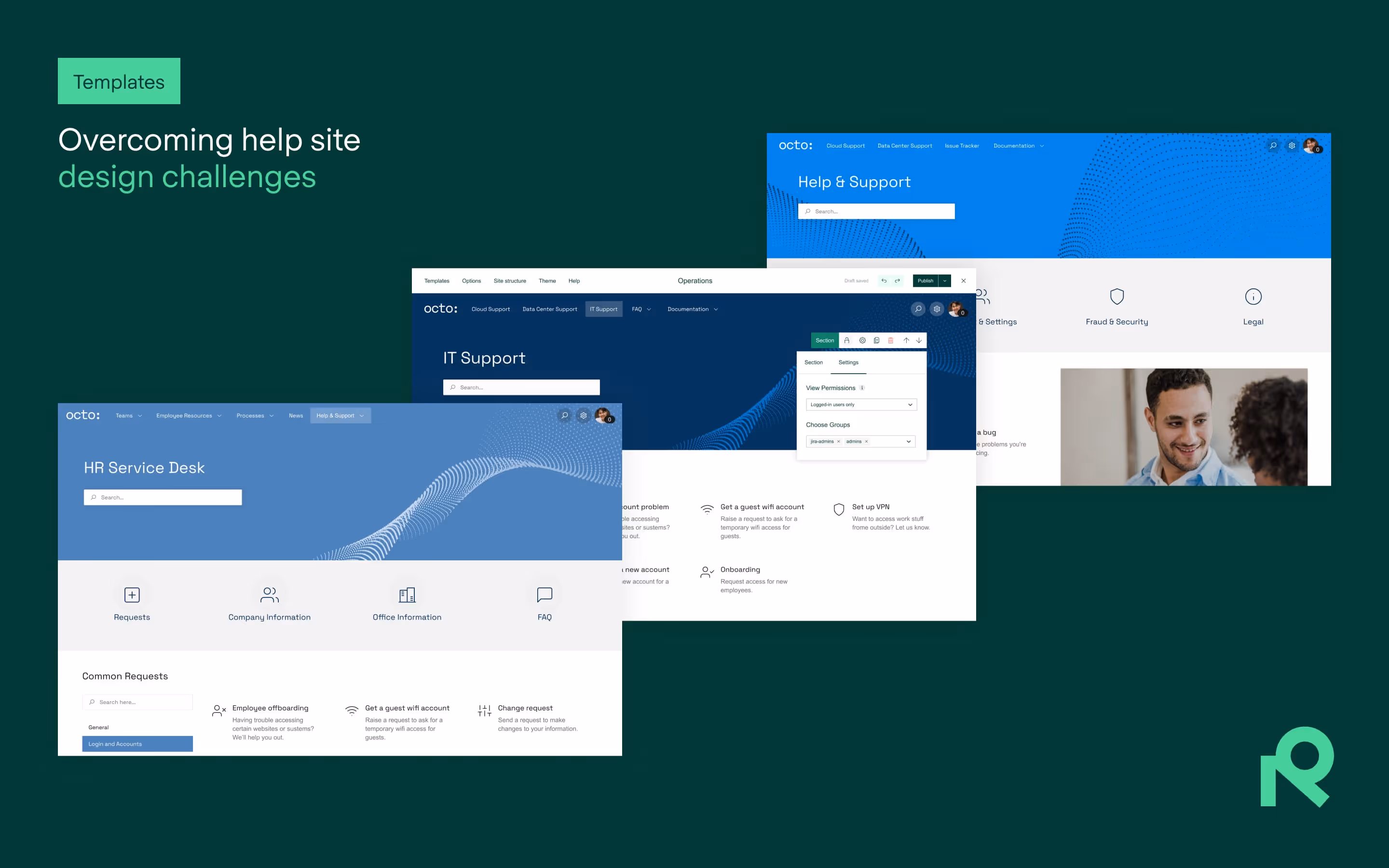
Building a user-friendly Confluence or JSM site can seem daunting – we show you a handful of customizable templates to help your users find the info they need, plus tips for making those templates work best for your content.
Website navigation is important to users. According to research by clutch.io, over 90% of respondents cited easy navigation as the most important aspect of a website.
That’s why Confluence and JSM users are increasingly choosing to share out important information and service functionality on websites that are instantly intuitive to users.
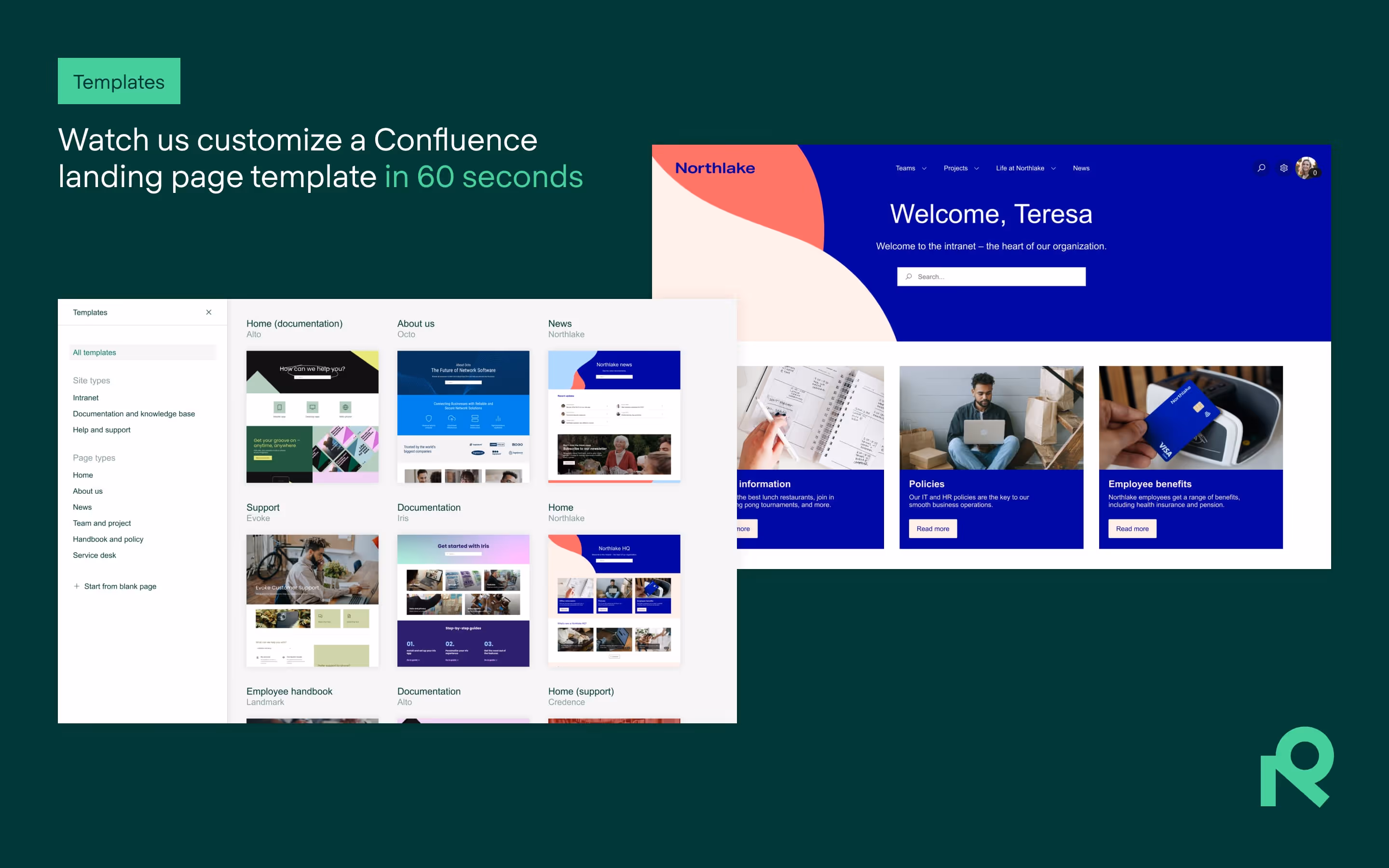
But where should you begin? That’s where our ready-made landing page templates for Refined Sites come in.
In this article, we’ll show you how to boost the navigation and user experience of your Confluence and JSM sites using landing page templates. We’ve selected four that can be easily customized to reflect your brand and user priorities.
Each template offers unique features tailored to meet specific needs, ensuring your users can easily find the information they need and interact seamlessly with your content. Each template is also easy for an admin to setup.
Which templates should you choose for your site? Let’s take a look.
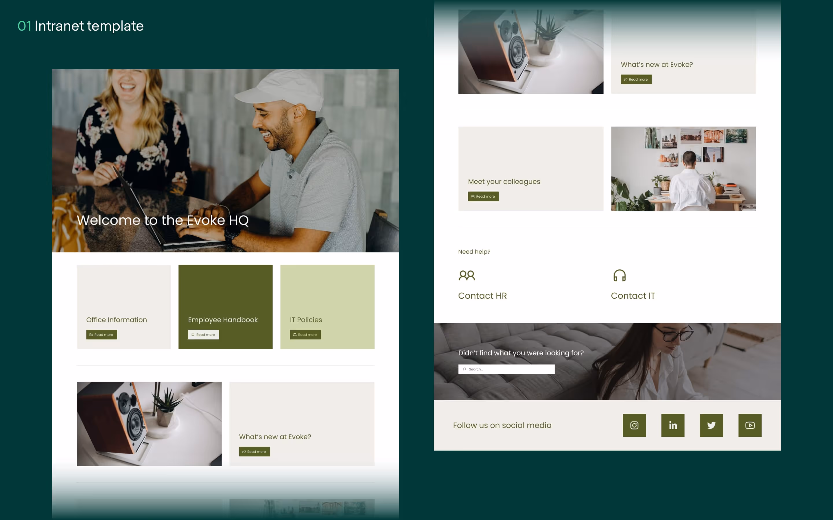
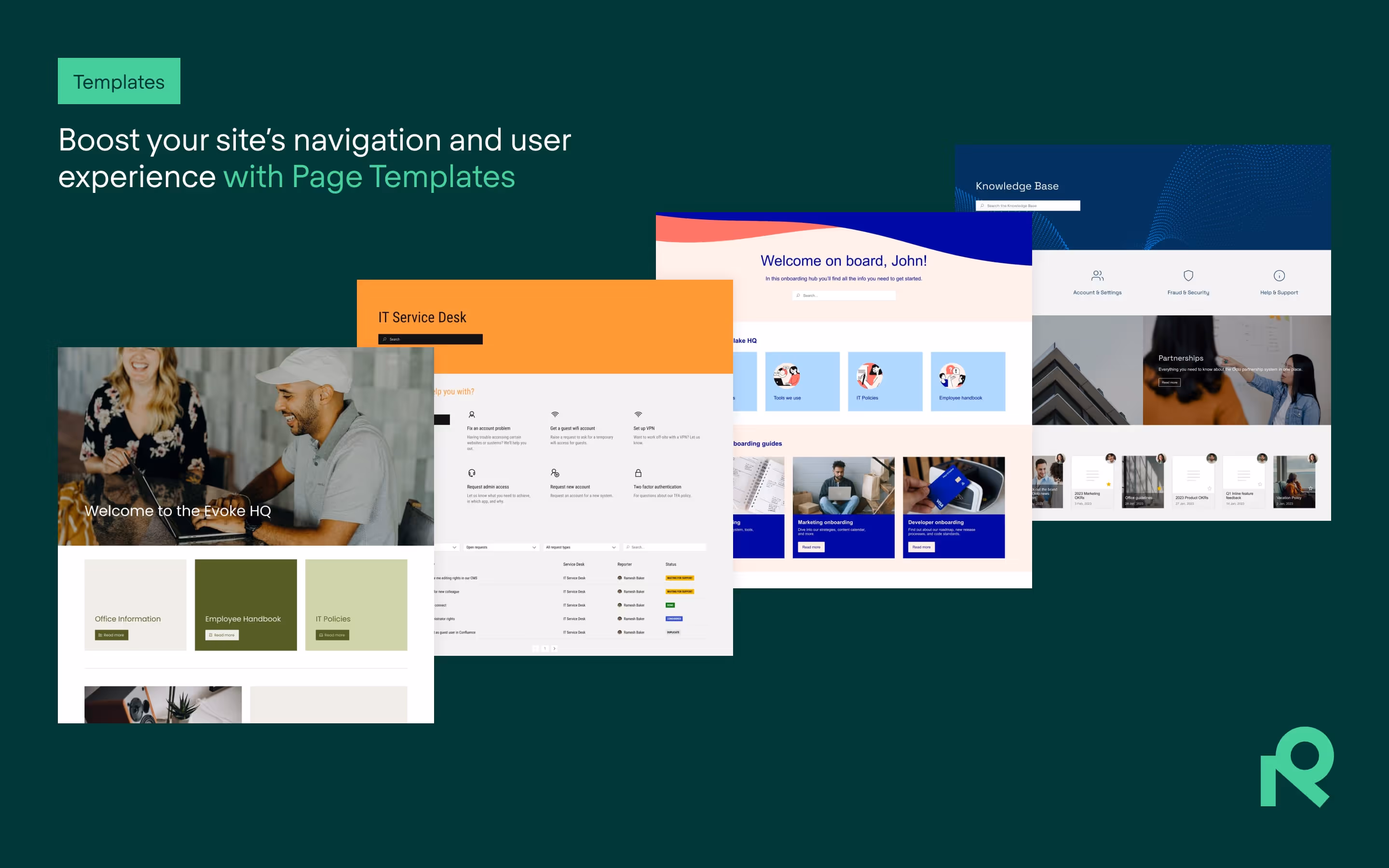
Every company needs a helpful intranet. It’s your opportunity to have a one-stop-shop for all employee information and documentation needs. But intranets can be a drag on productivity if employees get lost or can’t find what they need – that’s why it’s essential that yours is designed for easy navigation.
Here’s how our Evoke intranet templates can help you build a great site:
Well-structured landing pages can be the difference between users finding their way around and a lot of time wasted searching for information. You want to present information in a way that’s logical and intuitive for users based on their needs for that page. Evoke’s clean design, over which you can apply your own logo and branding, leaves room for personality while helping your users find what they need without the clutter of a dense landing page.
Begin by mapping out the main categories that will house all your intranet content, from departments to projects, resources, social areas – you name it. You can then create subcategories to further organize the information logically.
Presenting information in a modern-looking website is a pleasant surprise for users who might be used to bland corporate intranets. Plus, a good-looking intranet can be more in line with the customer experiences users enjoy outside of their work.
Use Evoke’s expansive space to nurture your company’s branding elements – including logos, colors, and fonts – to create a cohesive look and feel. Large, unobstructed image areas are an opportunity to visually communicate your brand and company culture to employees.
Evoke’s design elements can easily serve double duty in helping your employees stay engaged and feel connected.
How? By displaying and linking to content on your intranet in a way that’s easily accessible.
According to a study by Geckoboard, more than 50% of employees remarked that access to company information had a significant impact on their performance – and that of their organization.
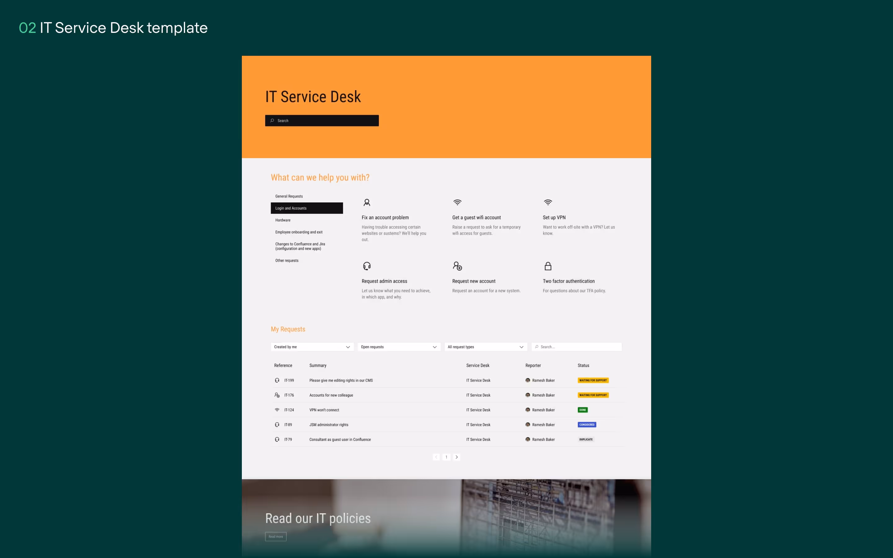
A well-designed IT service desk is not just a convenience, but a necessity for organizations aiming to provide modern, efficient support to their employees. Not only will it improve the quality of your operations, but it can also improve user satisfaction and transparency.
There’s several attributes that make the Landmark ITSM template a great option for building your IT service desk:
Users navigating a help desk want to find a way to get support fast – even more so if they’re feeling frustrated by the IT issues they’re facing. For that reason, it’s important to arrange the information on your page in a way that will feel natural for your users.
Landmark helps you accomplish that with a clean, uncomplicated page structure. Users are immediately greeted with a hard-to-miss search function, thanks to the template’s use of empty space (called whitespace in graphic design). The template then helps you guide users’ attention to an easily-readable collection of crucial information and links. These can be used to highlight resources that can drive down the volume of requests by helping users help themselves. You can customize this resource list according to the needs of your user groups and the types of requests they’ll want to raise.
As your users continue to scroll down, they will be introduced to the My Requests module, a clear, customizable user request tracker where users can conveniently keep tabs of requests they’ve made.
In keeping with a steady and approachable information hierarchy, you can use the pre-built banner towards the footer to link to your IT policies page or other documentation. This will help to fill user knowledge gaps without cluttering the service desk page.

Employee onboarding is a critical process that sets the tone for an employee’s journey within your organization. A well-designed onboarding site is incredibly important, often acting as a touchstone for your employee to orient themselves within your company culture, brand, and processes. You can significantly enhance this formative employee experience by providing clear information, easy navigation, and personalized content.
For that, the Northlake onboarding template is an excellent choice for several reasons:
Northlake makes ample use of whitespace, while providing layout touches that you can use to ensure a branded, personalized user experience. A welcome message sets a positive tone and helps your new employee get acquainted with your company and its culture.
User-centric messaging, a clear hierarchy of critical info for new employees, and direct access to step-by-step guides are important. With Northlake, critical guides for your new employee are highlighted clearly, with branded iconography helping to – once again – communicate the brand and company values to new hires.
Further down, an uncluttered layout puts links to tailored, team-specific onboarding guides at the forefront of the user experience. Use this area to clearly delineate access to specific onboarding documentation or help pages, based on, for example, your new hire’s role or team.
At the bottom of the page, a hard-to-miss banner designed to link to company “about us” pages serves as a smart spot to provide links to further information, helping new employees fill broad knowledge gaps.
Your knowledge base can improve customer self-service capabilities, enabling them to quickly find solutions to common issues. This not only improves customer satisfaction and reduces support inquiries, but also frees up your support team to focus on more complex problems, boosting overall efficiency.
But that only works if your customers can actually find what they need on your Confluence site. If you’re not building your landing pages for user navigation, your customers can quickly end up frustrated.
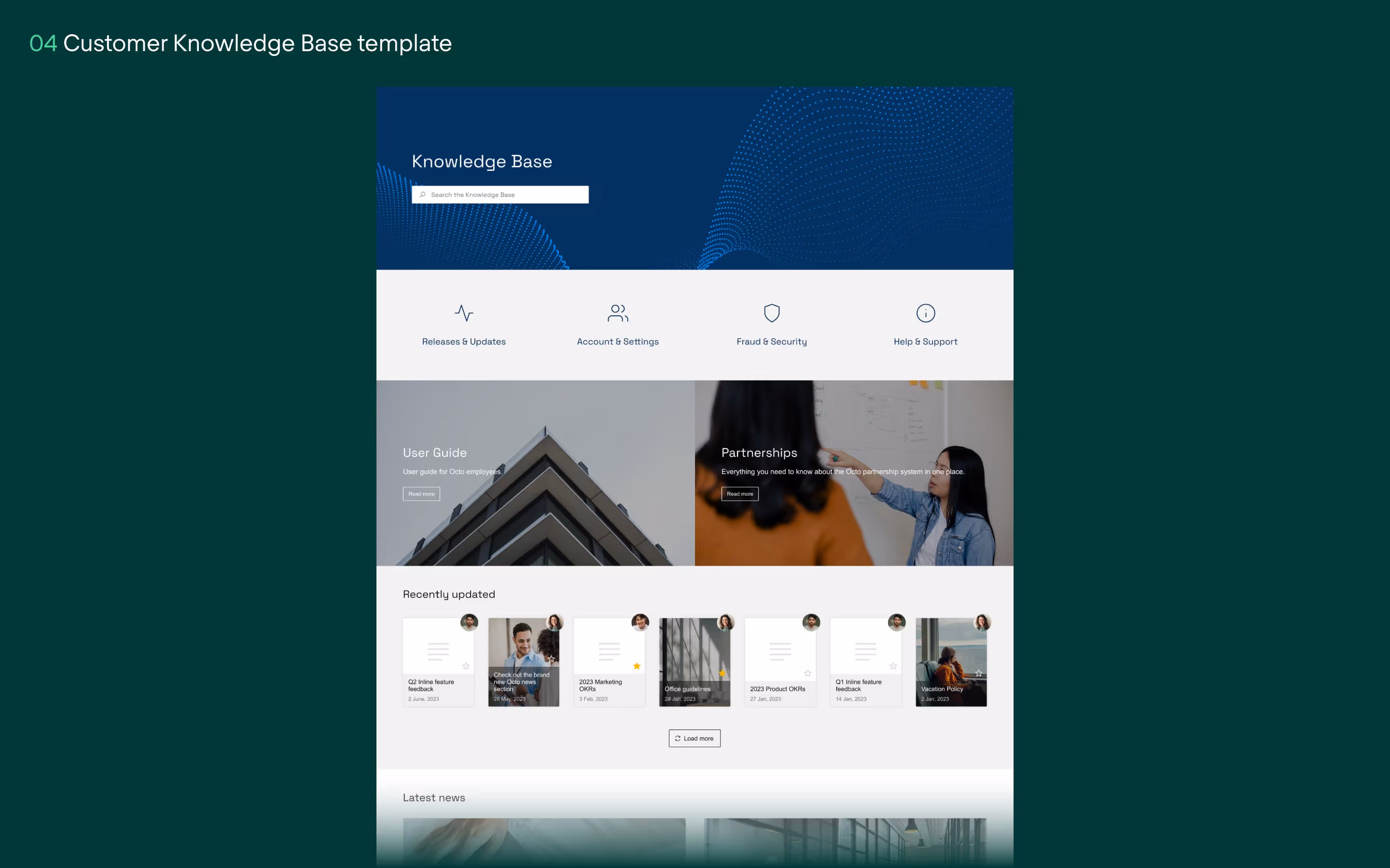
We’ve chosen Octo as a great template for a navigation-first approach to your knowledge base. Here’s how you can use it to keep your organization’s customers effectively informed:
Octo uses a layout with grouped panes to organize similar content. This approach ensures that topically related information is kept closer together, making it easier for customers to find what they need as their eyes scan the page. For instance, you can create separate groups of modules for different product lines or customer types, allowing users to navigate directly to the section that pertains to them. Or create clusters of modules for FAQs, user guides, and troubleshooting documents.
A benefit of how the page modules are arranged in Octo is that you can make them very eye-catching to users, depending on size and nested images. Use wide, spacious panes to direct user attention to crucially important pages that you know all customers will need to see. Then, use groups of smaller panes to visually categorize more focused or situation-specific content for your users.
Another useful feature of the Octo template are banners. They help you section off the page into areas of similar content, aiding in navigation. For example, you can use banners to portion off FAQ sections, user guides, and recent updates on the page. These visual cues not only enhance the aesthetic appeal of your knowledge base, but also help to guide your customers to the most relevant sections of a page.
You can also use banners to highlight specific page areas for a bit more impact – such as a dedicated FAQ section or the latest news and updates. Why? It helps in drawing customer attention to critical information, and ensures they don’t miss out on essential content.
Creating a user-friendly Confluence or JSM site doesn’t have to be a daunting task, even if you’re not a seasoned designer. We’ve shown you four templates that you’ll want to try out depending on what site you’re building, to ensure your pages are intuitive and accessible.
Each template serves a unique purpose:
These templates are not just about aesthetics – they’re about customizing your Confluence or JSM site into a powerful tool for easier navigation, communication, support, and user engagement.
And crucially, you’re not shackled into using those templates out-of-the-box – each template has been carefully made to be deeply customizable according to the needs of your users and brand.
Ready to start creating sites that leave your users with a smile? Try out Refined Sites for Confluence and JSM from the Atlassian Marketplace.
If you’re looking for some more inspiration, take a look at some of our demo sites.