7 ways our new page builder levels up your site-building experience

Our new what-you-see-is-what-you-get Page Builder is here. See how it makes for faster builds, enhanced customization and more.
We’ve been hard at work behind the scenes to reimagine the site-building experience in Refined, and it’s finally here in the form of our new, what-you-see-is-what-you-get Page Builder. Soon to replace the Layout Editor, the Page Builder is available as an early access program for existing customers, and out-of-the-box for new ones.
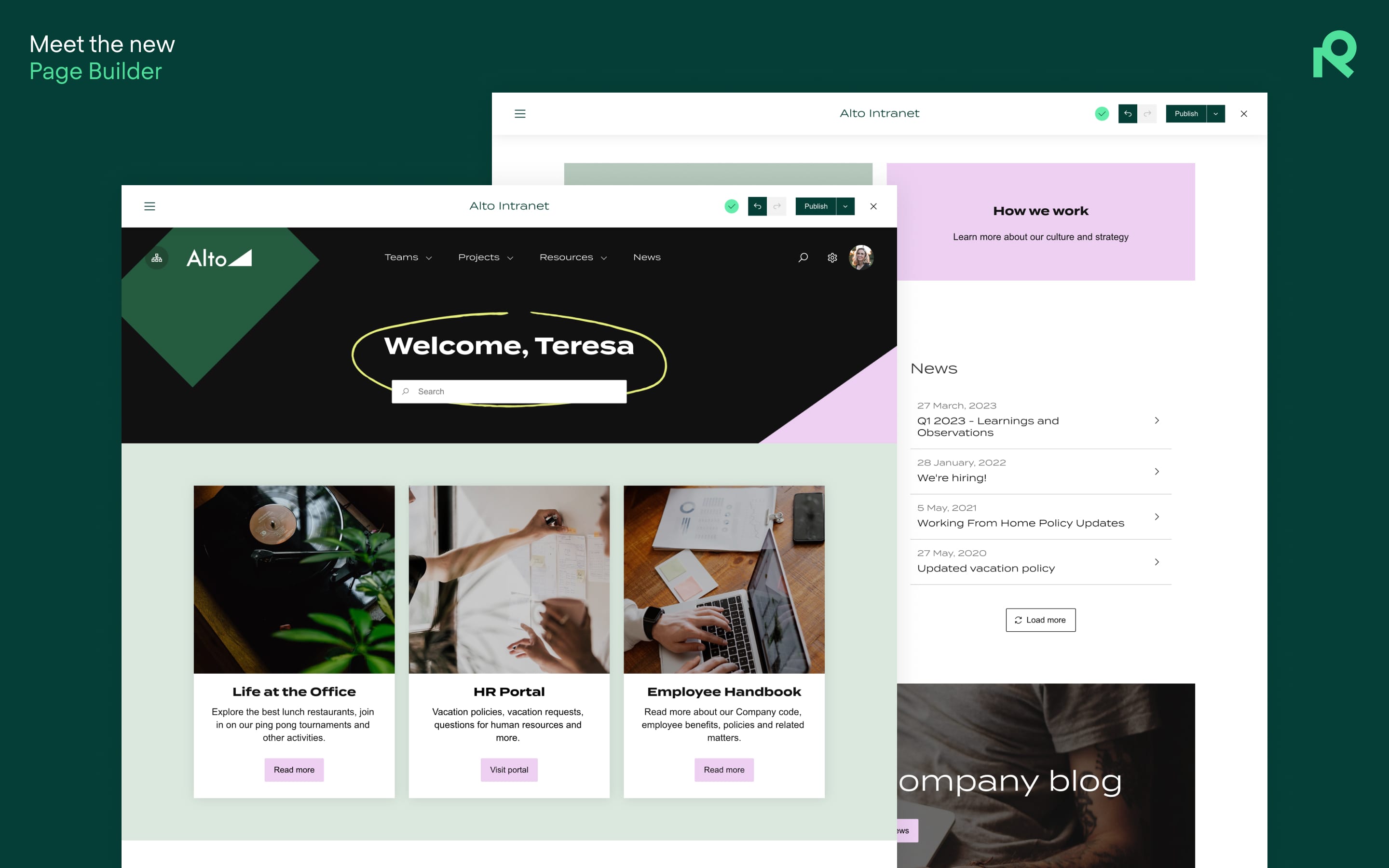
Beyond an overall improvement in the page-building experience — because you can see what you’re building as you go, just as your users will see it — the Page Builder comes packed with a host of improvements that promise to make site-building faster and easier than ever. Here’s a look at seven of them.
1. You can watch your pages come to life as you build.
The Page Builder lets you see your design come to life in real time exactly as your end users will see it—no preview necessary. Drag content where you want it, add and remove portions of the page with the click of a button, and slide a sizing bar to re-size modules across rows.

2. Site-building is faster and more flexible than before.
What-you-see-is-what-you-get site-building is vastly more intuitive than the previous module-based method. To that end, designing pages to look and work how you want them to is much faster.
Simply:
- Add sections, which act as containers for the content you want to display.
- Fill sections with modules—which can be everything from search bars to navigation icons.
- Divide sections into rows (as many as you want) and columns (up to six).

3. Experimenting with your design is quick and easy.
Undo and redo buttons make site-building less committal and more creative. Experiment with placement, sizing, colors, and so forth until your site looks and works how you want it to.
In addition to undo/redo, the Page Builder comes with new shortcuts to publish the page, add new content, or close the builder.

4. There are new possibilities for customization and design.
Backgrounds on sections and modules allow you to apply colors and photos to your site in new ways. You can set one background for the whole page, alternating backgrounds on rows, or even apply backgrounds to individual modules.

5. It’s easy to bake personalizations into the user experience.
While writing, hit $ to see how you can personalize your text. For example, the text variable $username allows you to personally welcome a user to your intranet.

6. All-new templates give you a running start.
Got blank page anxiety? The Page Builder contains all-new templates that make page builds as simple as selecting a pre-made design, or tweaking one to your liking.

7. Built-in tooltips help you get the most out of the tool.
Wherever you are in the Page Builder, built-in tooltips help you use it to its full potential. Additionally, links to helpful documentation and support are just one click away.

Try the new Page Builder
The Page Builder is available out-of-the-box for all new Refined Sites for Confluence and Refined Sites for Jira Service Management customers, which come with a free 30-day trial. Existing cloud customers get access to the Page Builder in phases:
- If you see a green banner in the Layout Editor, you’re ready to edit it in the Page Builder.
- If you don’t see the banner yet but can’t wait to give it a go, request access.
Read more about


Try Refined free for 30 days


